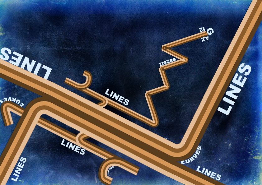
First thing that popped through my mind was a set of wires or cables. Than I saw pipes. So I enjoy this greatly. Even thought its not three-d, its still very impressive. I enjoy how the context of the picture is represented. The edges do bother me, but again I am OCD but other than that I do enjoy the text and how it comes off it.
Also I think the most greatest thing on that is the background because its black in the middle and then expands to blue, creating a night time theme or maybe a vast universe feeling to it. I hope you keep up your good work and do really well in the future.
First of all i want to start by saying that this is a very good start for doing a first typography artwork. Then i want to say, that all my points are my own personal perception, so apologies if i don't quite hit your mind
I really like the choice of colours you made, blue and brown always go togethere very well. choosing a Sans Serif font is clever, as it goes well with the lines and is not a concurrence to them like a Serif font would be. Using a texture is always a good way of achieving more depth and a more natural look, which works very well for this piece.
But talking about the texture, i think it might have too much contrast in itself, it takes a lot of attention, which should rather be on the lines and the typography. Now i dont't know wether the texture itself is already blue, or wether it is colored, but i think it would be worth a try to put the texture as top layer and multiply with the rest of the artwork, including lines and typography. that might pull the whole thing a bit more together. I would definetely change the corners of the lines in the "zig zag"-part. i know that happens in illustrator, but with transforming the lines into shapes, you could probably get rid of these. To add more depth to the curves, you could use a little drop-shadow at about 15% transparency, especially there, where the curves overlay each other. About the typogrpahy: i like the placement and the turns it makes. but i would try to keep the same distance between the words and the lines. it sometimes looks a bit off, and trying to keep the same distance might help to make the whole piece a bit "tighter".
Overall, i think it's a good piece of typography with a lot of potential to become even better. I hope you like what i wrote ...and i hope it's good to understand
Thank you sooo much for the comment and the fav!! That's really a booster! anyways i'll try to make another one as what u suggested......![a entirely newer version maybe!! thanks!!
Also I think the most greatest thing on that is the background because its black in the middle and then expands to blue, creating a night time theme or maybe a vast universe feeling to it. I hope you keep up your good work and do really well in the future.
Then i want to say, that all my points are my own personal perception, so apologies if i don't quite hit your mind
I really like the choice of colours you made, blue and brown always go togethere very well. choosing a Sans Serif font is clever, as it goes well with the lines and is not a concurrence to them like a Serif font would be.
Using a texture is always a good way of achieving more depth and a more natural look, which works very well for this piece.
But talking about the texture, i think it might have too much contrast in itself, it takes a lot of attention, which should rather be on the lines and the typography. Now i dont't know wether the texture itself is already blue, or wether it is colored, but i think it would be worth a try to put the texture as top layer and multiply with the rest of the artwork, including lines and typography. that might pull the whole thing a bit more together.
I would definetely change the corners of the lines in the "zig zag"-part. i know that happens in illustrator, but with transforming the lines into shapes, you could probably get rid of these.
To add more depth to the curves, you could use a little drop-shadow at about 15% transparency, especially there, where the curves overlay each other.
About the typogrpahy: i like the placement and the turns it makes. but i would try to keep the same distance between the words and the lines. it sometimes looks a bit off, and trying to keep the same distance might help to make the whole piece a bit "tighter".
Overall, i think it's a good piece of typography with a lot of potential to become even better.
I hope you like what i wrote
Cheers,
Anne | =pica-ae
Critique courtesy of *devCRIT.
The Artist has requested Critique on this Artwork
Please sign up or login to post a critique.